A storystelling rebrand

Livermore pride
Livermore Pride advocates for the LGBTQIA+ community through a range of workshops and events, fostering education and inclusivity. Feeling a disconnect between Livermore Pride's work and branding, I took it upon myself to refresh their look and tell their story.
BEFORE

AFTER
THE story
Nestled in the SF East Bay, Livermore boasts a unique blend of rodeo and western traditions alongside a strong presence in the tech and science sectors due to its world-renowned laboratory, complemented by a vibrant wine scene with numerous local wineries. Livermore's conservative ranching roots have also left their mark, making organizations like Livermore Pride even more important in showcasing the town as an inclusive and diverse community for all.
REPRESENTATION OF LGBTQIA+ community
COMMUNITY OUTREACH
LIVERMORE’S ranching HERITAGE
sketching iconography

From research, the three key elements that were important to represent in Livermore Pride’s logo is
the representation of LGBTQIA+ symbolism
the organization's remarkable community outreach efforts
a tribute to Livermore's heritage
finding symbolism
Telling a story through a simple icon is a rather complicated task. For Livermore Pride, seamlessly blend the three key elements was crucial in communicating their community and ethos.
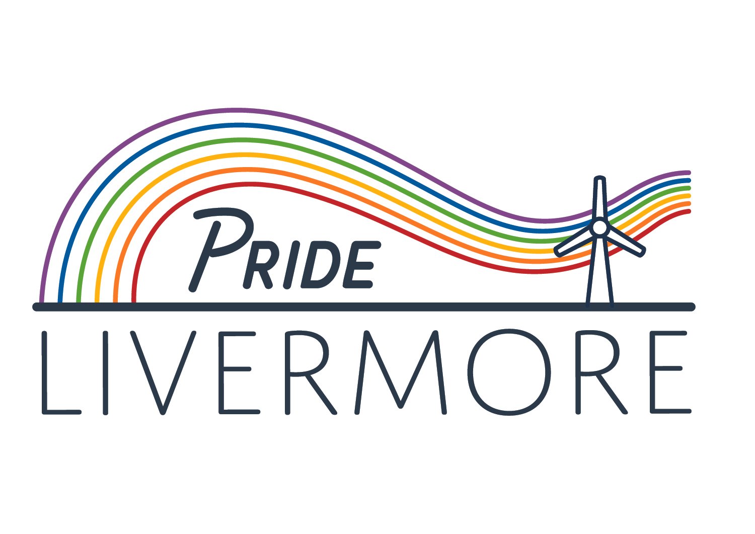
rainbow color: Reflects the diversity of the LGBT community
Reaching hand: represents community OUTREACH and support
Horseshoe shape: Symbolizes LIVERMORE’S ranching HERITAGE

typography
The deliberate choice of these font pairings was guided by the intent to seize attention and instigate a lasting, one-of-a-kind visual impact.

application
The new logo and brand design is adaptable and transformative as it can be applied to merchandise, online content, and other digital assets. I believe Livermore Pride’s new brand will help tell their story and connect with their community.


